Blind Magazine : photography at first sight
Photography at first sight
Search
Close this search box.
Righting Auto-Rotate and Crop

Righting Auto-Rotate and Crop

I have a slightly dysfunctional relationship with my iPhone. It shows all the signs of codependency: I love that my iPhone is always there for me. It confirms my expectations when I photograph the beach at sunset and it flatters me in portrait mode. But, I also revel in its failures. I sigh at the camera when it struggles to find focus when photographing artwork. I give it a little patronizing help when it attempts facial recognition on realistic drawings. Our contest began when the camera started trying to outsmart me by auto-rotating and cropping my photos. I was not alone in my frustration. Reddit forums were full of users aggravated by these automated features. Here’s a typical comment: “The auto-cropping is almost never what I want.” Another describes auto-rotate as an “(admittedly tiny) detail that still infuriates me to no end.” Redditors now surmise that Apple was paying attention to their complaints, since the auto-crop feature was removed from iOS 14.

Why did auto-rotate and crop get it so wrong? And why did this “admittedly tiny” problem cause such outsized reactions? Maybe it feels silly to anthropomorphize the camera, but these machines were built by humans and in them we can see evidence of human preferences and even unconscious bias. The sharpness, saturation, and contrast of most smartphone photos conform to contemporary ideals. Yet, the rules used to auto-rotate and crop pictures were outdated; they were clear throwbacks to advice that has appeared in instructional manuals for amateur photographers since the early twentieth century. In the words of Kodak, these how-to books promised to teach a reader “how to make good pictures,” but it was still up to the photographer to follow the guidebook’s proscriptions. With the rise of the first true point-and-shoot cameras in the 1970s, automatic focus and exposure began to override the errors that had once plagued amateur photographs.

How to make good pictures, 1987 © Kodak

For all the errors that couldn’t be corrected by the camera’s automated systems, some photo labs began labeling bad pictures with stickers, which pointed out evidence of operator errors. One sticker described back-lighting, which resulted in faces shrouded in shadow. Another diagnosed lens obstructions, such as fingers and dangling camera straps, and pedantically explained that not all cameras use through-the-lens viewfinders. Still others identified flash-sync or film-loading and film-advance errors.

Smartphone cameras obviate the need for such instruction, because they apply the rules unilaterally. Auto-rotate and crop caused angst among photographers who rejected those rules and yet saw them applied to their photos automatically. Correcting the camera’s choices (over and over again) taught me something about the kinds of photos that I took most often and reminded me (over and over again) that software engineers didn’t consider these good pictures – or even pictures at all. Apple Photos advertises that it “intelligently searches and curates your photos and videos to find trips, holidays, people, pets, and more, then presents them in beautiful collections.” My many note-taking photos of receipts, pages of books, or even copies of artwork are nowhere to be seen in this world.

Andy Warhol, 1972 © Duane Michals

Artists have been deliberately rejecting the rules since the rules were written. When a new set of rules is widely adapted, then they’re overturned again. In the history of photography, these rules are often related to new technological developments, which initially promise better pictures, but eventually produce boring and generic ones. Instead photographers often look backwards and appropriate former accidents, such as motion blur or on-camera flash, as markers of creative independence. They place points of interest at the edges of the frame. They include too much white space. They tilt the horizon. They challenge the rules and reveal the biases inherent in any guidebook that claims to represent the best, most natural way of making good pictures.

The iPhone’s auto-rotate feature used the internal gyroscope to detect the motion of the phone while making a picture. It assumed that a user would turn the phone counter-clockwise to take a  photo, keeping the shutter button on the right-hand side. Then it could simply rotate the picture clockwise to correct the orientation. In some situations, it used algorithmic methods to identify and straighten the horizon line. This advice on straightening has a long history in amateur photographic literature. As soon as small, hand-held cameras freed photographers from tripods at the end of the nineteenth century, how-to books began directing amateurs to keep their cameras level.

Why My Photographs Are Bad, 1902 © G.W. Jacobs & co

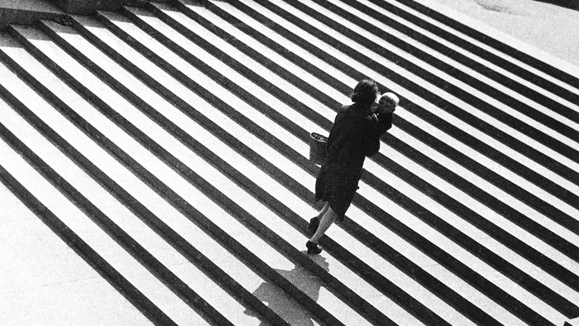
A 1902 manual, called Why My Photographs Are Bad, provided an illustration of a tilted horizon in which the masts of boats in a harbor all point crookedly to one o’clock. The author confided with dismay: “I have known amateurs to overcome all the early difficulties in photography, and yet to fail repeatedly in their pictures, because they forgot to make sure that the camera was perfectly level while focusing.” Forty years later, the Kodak manual How to Make Good Pictures described a similar example. The editors warned: “Tipping the camera sideways even makes boats sail downhill.” Tilted horizons figured prominently on lists of common errors during most of the twentieth century, even if they also became markers of dynamic movement in photographs by avant-garde practitioners, such as T. Lux Feininger or Alexander Rodchenko, and street photographers at midcentury.

After rotating a photo, the smartphone camera cropped it. Cropping wasn’t even part of the photographic lexicon until the late 1930s. Prior to the improvement of small-format negatives and the invention of electric-light enlargers, negatives were usually contact-printed full-frame or minimally masked. With the popularization of 35-mm cameras, how-to authors began recommending that readers do their composing in-frame, rather than cropping in the darkroom. They implored new photographers to get close to their subjects so that they could preserve maximum resolution in the final print. “You may not always be able to get just as close to the subject as you would wish, but get as close as you can,” Stanley Bowler prodded in his 1962 book Beginner’s Guide to the Miniature Camera.

Charleston on the Bauhaus Roof, 1927 © T. Lux Feininger 
Stairs. 1930 © Alexander Rodchenko, Collection of the Multimedia Art Museum, Moscow

How-to authors also scolded amateurs for including too much in their pictures. Kodak explained in 1936: “One of the faults most often seen in the work of the beginner is the desire to include too much within the confines of the picture. There is frequently material for two or even more complete pictures crowded into one.” New photographers were instructed to hone in on one or two elements to simplify busy scenes.

Both strains of advice were evident in the smartphone’s auto-crop function. It abhorred white space and zoomed in on central subjects for emphasis. The Recompose Tool in Photoshop Elements aims for a similar effect, using machine learning to identify salient areas of the image and removing space between them in order to reorient or rescale a photo.

Imagine what auto-crop would do to a Stephen Shore photograph. Many of his images in Uncommon Places rely on details carefully balanced around the edges of the frame. Wilde Street and Colonization Avenue, Dryden, Ontario features a delicate knot of wires at the very top edge of the frame. There’s a wide blue sky cut through by another telephone wire in Cumberland Street, Charleston, South Carolina. These details make the pictures, but they would confound the auto-crop function, because they seem accidental or extraneous according to the Kodak metrics. Auto-crop would also fail Paul Strand’s tightly-framed, imbalanced Vermont Church, Diane Arbus’ equally tenuous twins, and Rinko Kawauchi’s dreamy family moments. I’m drawn to these images, and others that subvert the rules of composition and framing, focus, or exposure, because it’s that little bit of ‘wrong’ that makes them feel so real and right.

Cumberland Street, Charleston, South Carolina © Stephen Shore

Similarly, auto-rotate and crop are worth studying. These automated functions reveal the intention of the camera and its designers more truthfully than any press release, because many of these choices are unconsciously preferred. Over the past several years, Twitter users began noticing some suspect image-cropping decisions made by the app. In May of 2021, the company released the results of internal research, which confirmed that the app’s automated cropping function favored images of white people over Black people and women were preferred to men. When images exceeded the scale of Twitter’s wide-screen view, an algorithm tried to identify salient features and center them in the cropped preview frame. Machine learning reflected the cultures’ unconscious biases. These design decisions, which might seem at first like they belong to the realm of aesthetics, have real political and social impact. They decide who and what is seen. Each time we wrestle with the automated features, we should be reminded that aesthetic rules are socially constructed. Like so-called ‘good pictures,’ the rules are made, not merely found in nature.

By Kim Beil

Kim Beil is a scholar of visual culture at Stanford University, with an emphasis on the history of photography.

Don’t miss the latest photographic news, subscribe to Blind's newsletter.